Instructional design/Color Selection for Message Design/Unit3 Effects
|
Color Selection for Message Design |
|
Unit 1 High- and Low-Keyed Colors Unit 2 Warm and Cool Colors Unit 3 Color Combinations Unit 4 Psychology of Colors Final Exam! |
Effects of Color Combinations[edit | edit source]Generally, analogous, complementary, and split complementary colors form the following impressions:
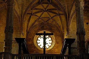
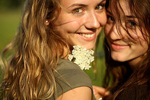
Examples of the Effects of Analogous Color[edit | edit source]Warm[edit | edit source]Analogous colors convey a warm feeling. While you have no clue of the temperatures of the places, you might have a feeling that the places are warm rather than cool. Calm[edit | edit source]If you want to create a calm atmosphere, it is a good idea to use analogous colors. You may sense the quietness of the places from the pictures. Harmonious[edit | edit source]Another effect of analogous color is to give a harmonious feeling. If you want to show the harmonious atmosphere in places or between people, consider using analogous colors. Examples of the Effects of Complementary Color[edit | edit source]Striking[edit | edit source]People's eyes sense complementary colors in a unique way. If the complementary colors face each other, people sense the facing area looks vibrating. Complementary colors can create a dynamic or powerful atmosphere in this way. Examples of the Effects of Split Complementary Color[edit | edit source]Sharp[edit | edit source]Split complementary colors make strong contrasts and thus create a sharp atmosphere. You might sense artistic and unique feelings conveyed by the pictures. Smoother than Complementary Color[edit | edit source]While split complementary colors create a sharp contrast, they tend to look more natural than complementary colors. While you might feel sharpness from the pictures, you might not feel a strong uncomfortableness either.
|


