Instructional design/Color Selection for Message Design/Unit1 Definition
Jump to navigation
Jump to search
|
Color Selection for Message Design |
|
Unit 1 High- and Low-Keyed Colors Unit 2 Warm and Cool Colors Unit 3 Color Combinations Unit 4 Psychology of Colors Final Exam! |
Definition of High- and Low-Keyed Colors[edit | edit source]A key is not only what you carry in your pocket to unlock doors! Key, as it relates to color, is the amount of lightness and darkness. High-keyed colors are often referred to as pastel colors, and low-keyed colors are often referred to as dark colors. Also, in fine art, key is often referred to as value.
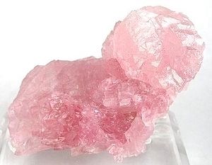
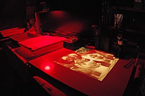
Examples of High-Keyed Colors[edit | edit source]Examples of Low-Keyed Colors[edit | edit source]
|


