Instructional design/Color Selection for Message Design/Unit2 Effects
|
Color Selection for Message Design |
|
Unit 1 High- and Low-Keyed Colors Unit 2 Warm and Cool Colors Unit 3 Color Combinations Unit 4 Psychology of Colors Final Exam! |
Effects of Warm and Cool Colors[edit | edit source]Warm and cool colors are found to form the following impressions:
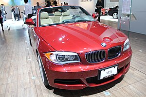
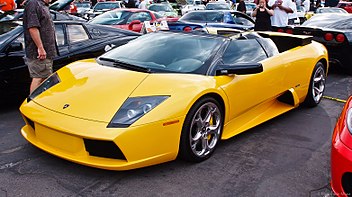
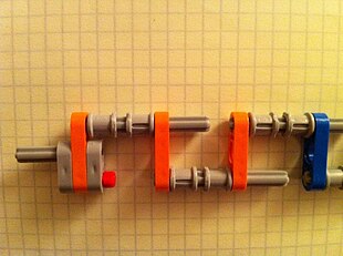
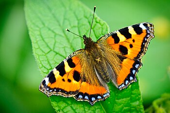
Examples of the Effects of Warm Colors[edit | edit source]Comes Forward[edit | edit source]While both the cars stop at the area, you might have a feeling that they are moving forward. As such, warm color objects in pictures are perceived as coming forward. Looks Larger[edit | edit source]While the orange and blue joints of the left picture are same length, you might have a feeling that the blue one is shorter. Similarly, while it is apparent that the right picture consists primarily of green color, you might have a feeling that the moth is large because it consists of a warm color (orange). Examples of the Effects of Cool Colors[edit | edit source]Moves Backward[edit | edit source]You might think that "nothing stands out in the pictures." Cool colors tend to move backward and do not stand out. They are more appropriate for background than for foreground elements. Looks Smaller[edit | edit source]Compared with warm colors, cool colors look shrinking than expanding. When you want to indicate the smallness of something, you would want to consider using cool colors.
|
