OToPS/Data visualization/Exploratory visualization
This provides some quick examples of how to build and read some exploratory visualizations. The set is not intended to be comprehensive -- there are many entire books and websites dedicated to the topic.
Instead, in the OTOPS spirit, we focus on our favorite techniques. Why? We use them the most. The wisdom of the crowd and practical experience tell us these are "go to" techniques. They are effective. And for data workers, they are familiar.
To outsiders, they may look foreign, ugly, or overwhelming at first -- which is why this set of methods is geared towards "inside" use, making sure that we understand the data before we even try to explain it to external audiences.
If you only could learn three methods, the histogram, box and whisker plot,

and the scatterplot would be enough to get you through 80% of your EDA needs. That set covers the bases across the levels of measurement, and it also provides exploratory visualizations for comparing means (the box plot leads naturally to the Student's t-test and ANOVA, or their nonparametric equivalents) and the scatterplot is the basic visualization for correlation and regression (and helps a lot with outlier detection).
Histograms
[edit | edit source]When to use them:
[edit | edit source]How to make them:
[edit | edit source]Simple:
[edit | edit source]Base R includes the "hist" function, that will make histograms.
One word of code is enough!
```{r Simple scoring example}

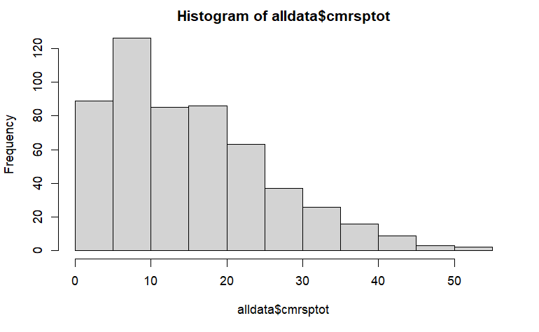
'''hist'''(alldata$cmrsptot)

```
That code produces something like this:

Intermediate:
[edit | edit source]Complicated:
[edit | edit source]ggplot2 has a bunch of options. One that is very helpful is being able to rotate the bar chart or histogram horizontally. This lets us use horizontal text for the labels, lining up with the direction our eye naturally reads text (versus rotating the text to squeeze into the constrained space of a vertical bar orientation).
Next level:
[edit | edit source]Population pyramids (aka back-to-back histograms)
Boxplots
[edit | edit source]When to use them: nonparametric picture of central tendency (middle 50%), asymmetry (skew), outliers
How to make them:
Simple:
[edit | edit source]Base R includes the "boxplot" function.
One word of code is enough!
```{r Simple scoring example}

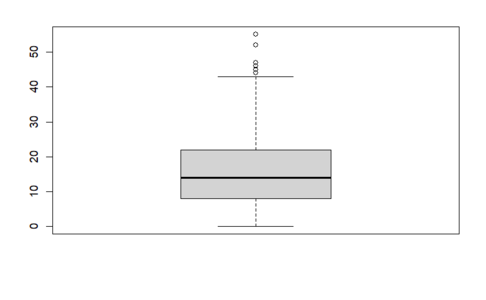
boxplot(alldata$cmrsptot)

```
That code produces something like this:
Complicated:
Split by a factor; ggplot2
Next level:
Superimpose a violin plot or a beeswarm. Here is an example[1] of a violin plot. It visualizes results after controlling for covariates and includes an added jitter effect showing the data distribution.

Here is the code used to create this plot, which can be adapted for other research projects.
effect_plot(results2, pred = traumaTypes, interval = TRUE, plot.points = TRUE, jitter = .2)
fill_values<-scales::seq_gradient_pal("#99badd", "#4ea4f7")(seq(0, 1, length.out=5))
ggplot(cpssFileNA, aes(x = traumaTypes, y = resids)) + geom_violin(aes(fill = traumaTypes)) + geom_jitter(aes(color=CPSStot)) + labs(x = 'Trauma Types', y = 'PTSD Symptom Severity', position = position_jitter(.15)) + scale_fill_manual(values=fill_values) + scale_color_gradient2(low="#0055B3", mid="white", high="#0055B3", midpoint = mean(cpssFileNA$CPSStot), limits=c(0, 50), labs(y = "PTSD Symptom Severity")) + scale_x_discrete(labels = c('No Trauma', 'Physical Abuse','Neglect','Sexual Abuse', 'Multiple Types'))
Scatterplots
[edit | edit source]When to use them:
[edit | edit source]two dimensional/continuous variables
How to make them:
[edit | edit source]Simple:
[edit | edit source]plot
Complicated:
[edit | edit source]pairs.panels, correlogram; ggplot
Next level:
[edit | edit source]pairs.panels, or type layering (see Follet et al. for example)
Small multiples
[edit | edit source]Cleveland and Tufte -- two giants in the visualization world -- developed and popularized the idea of small multiples.
par(mfrow...) trellis
and now let's look at pairs.panels again
Pairs.Panels
[edit | edit source]When to use them:
[edit | edit source]How to make them:
[edit | edit source]
.
Data Visualization Within Posters
[edit | edit source]Below are just a few examples of how data visualizations, like the ones described above, are presented within posters.

.
Placing Code in Speaker Notes of Presentation
[edit | edit source]For both educational and replication purposes, it can be helpful to place your data visualization code within the speaker notes of your presentation (example below).


.
What's missing?
[edit | edit source]We deliberately left out some familiar ones, because experts think they are inefficient and hard to interpret (pie charts are an example -- lots of ink for a handful of numbers; and boxplots provide more than 5x as much information as a similar bar chart).
What are some gaps you may need to address? If your analysis is going to look at two or more nominal variables (a chi-squared scenario), making a set of histograms will tell you about each variable by itself, but it won't provide a picture of if and how they are related. This is similar to how histograms (or boxplots) of height and weight will tell you about the distribution of each, but nothing about whether they are correlated -- a scatterplot would show that more directly and clearly. We need a visualization equivalent of a scatterplot for categorical variables. They exist, and R can make them, but we'll need to use ggplot2 or specialized packages like mosaic designed specifically for that scenario.
If you only take away one thing....
[edit | edit source]Remember the idea that a "vital few" versatile plots will be tools that get you through ~80% of what you need to understand patterns in your data!
External links
[edit | edit source]Here are some helpful pages:
References
[edit | edit source]- ↑ DuBois, C. M., Youngstrom, E. A., Youngstrom, J. K., Feeny, N. C., Findling, R. L. (2021, June 17-19). Sexual abuse and female identity significantly predict PTSD symptom presentation in children and adolescents. Poster presented at the Journal of Clinical Child and Adolescent Psychology’s 5th Annual Future Directions Forum, Washington, DC, United States. https://doi.org/10.17605/OSF.IO/UD6YB

