Talk:COVID-19/Dan Polansky/2020-Q1Q2
Mike Graham wrong about Sweden
[edit source]Let's have a look at some utterances Mike Graham made about Sweden in Mike Graham v Peter Hitchens: Round 4, Apr 27, youtube.com:
- MG: "It's 2000 [deaths] in one day [about Sweden]" [...]
- MG: "But the point is that it's rising, right?" [...] PH: "Of course it's rising [...] people do not come back to life"
It was 2000 total deaths, as Peter Hitchens pointed out. Mike Graham admitted possible mistake, but kept on pressing his point as if no refutation happened. To the end, Mike Graham was spinning the narrative toward Sweden doing badly, despite being refuted.
How was Sweden really doing on Apr 27, based on official figures available from W:2020 coronavirus pandemic in Sweden, sourced from official Swedish pages?
- The confirmed cases were increasing approximately linearly, on the order of 700 cases a day.
- The deaths were going down, with peak of about 100 deaths a day on Apr 14, going down to about 50 deaths a day on Apr 27 and days before it.
Therefore, the situation looked very hopeful for Sweden since 1) linear increase of cases is generally manageable, 2) deaths were even going down, for unexplained reasons (prohibition of private visits to nursing homes? Who knows), 3) the deaths per capita were not so bad; on Apr 28, Sweden had about 230 cumulative deaths per million inhabitants; and 4) there were no signs of overload of healthcare system, such as running out of ICU beds.
Another way of evaluation is to look at Euromomo[1]: there, Sweden has some excess deaths, peaking with the z-score of 14.5, but that is a number similar to the peak of Switzerland, which has the peak z-score of 12.65; UK (England) has peak z-score of 44.1. Thus, in Sweden, the covid is visible in excess deaths and is not a result of mere misassignment of cause of deaths, but does not seem particularly bad relative to other countries. As a reservation, the Swedish result may be due to unique features of Swedish demographics; careful and skeptical analysis is required before one jumps to conclusions.
The above is not to suggest that the Swedish approach is exactly and one-to-one replicable elsewhere: there may be significant demographic differences such as many more single households in Sweden. But the point remains: Sweden is doing well.
--Dan Polansky (discuss • contribs) 21:39, 1 May 2020 (UTC)
Later: Let me share a graph calculated from the data from German Wikipedia (de:W:COVID-19-Pandemie in Schweden#Todesfälle), which is based on Johns Hopkins data:
| Graphs are unavailable due to a known technical issue. Updates on reimplementing the Graph extension can be found on Phabricator and on MediaWiki.org. |
The above graph seems better than the FOHM graph[2] in that its rightmost part has no deceptive effect caused by reporting delay. On the other hand, any peaks in the above graph are delayed compared to real death peaks since the graph is doubly delayed: 1) the reporting day is delayed compared to death occurrence day; 2) the moving average introduces additional delay. A similar graph but with 3-day moving average is at Worldometers:Sweden.
Let us make a graph of daily deaths by date of occurrence, ignoring last 7 days to prevent the deceptive effect of registration delay:
| Graphs are unavailable due to a known technical issue. Updates on reimplementing the Graph extension can be found on Phabricator and on MediaWiki.org. |
The above has no deceptive end (we dropped last 7 days) and it peaks earlier than the 7-day moving average of deaths by day of report. --Dan Polansky (discuss • contribs) 09:20, 6 May 2020 (UTC)
Let us also plot daily cases from de:W:COVID-19-Pandemie in Schweden, sources from FOHM:
| Graphs are unavailable due to a known technical issue. Updates on reimplementing the Graph extension can be found on Phabricator and on MediaWiki.org. |
--Dan Polansky (discuss • contribs) 13:08, 6 May 2020 (UTC)
Excess deaths via all-case weekly deaths
[edit source]Determination of deaths caused by the covid is fraught with difficulties: there may be overreporting by counting too many covid-positive deaths as covid-caused deaths and there may be underreporting by not counting deaths at homes not tested for covid and similar.
The above problems are addressed by looking at all-case weekly deaths. Assuming there is just a single potential source of the all-case deaths being increased and it is the covid, assigning the apparent excess over long-term averages to the covid seems relatively safe. There are some reservations such as that the cause of the increase does not need to be the covid but they seem surmountable.
All-case weekly deaths can be obtained from sources listed at COVID-19/Dan Polansky#General death statistics.
One recent source for graphs with weekly deaths is Global coronavirus death toll could be 60% higher than reported, Apr 26, ft.com (Financial Times). It shows all-cause death graphs for multiple regions, including countries and cities such as New York City. Let us have a look at the numerical relations it reveals. It shows not only interesting graphs but also certain percentages of increase above a baseline. The percentages need to be carefully interpreted; they do not relate to the whole time range shown but rather only to the portion of the time range corresponding to "weeks of a location’s outbreak in March and April 2020". The time range serving as the basis of the percentage is not indicated in the graphs, information presentation deficiency. The time range is not exactly identified anywhere else in the article and it varies for different graphs since the start date and end date vary: for Italy, it seems to end on Apr 1 whereas for Netherlands, it seems to end around Apr 10. Arguably, the percentage presentation is misleading but the percentage is interesting nonetheless. As a further downside, the article does not identify the data sources from which the graphs were made.
For Italy, it shows 90% increase, which seems achieved in the time range mid Feb and Apr 1. From this we can calculate the percentual increase over range Jan 1 to Apr 1. The original percentage base period has about 45 days while the target period has about 90 days. Therefore, the increase is (1.9 * 45 + 1 * (90-45)) / 90, amounting to about 45% for Jan 1 to Apr 15. In the graph we see the curve going down; ignoring the deaths after Apr 1, we get via (1.9 * 45 + 1 * (365-45)) / 365 the increase of 11% for Jan 1 to Dec 31; the real value will be a little higher for the remaining deaths.
For Bergamo, Italy, it shows 463% increase for mid Feb to Apr 1. We get via (5.63 * 45 + 1 * (90-45)) / 90 the increase of 231% for Jan 1 to Apr 1 and via (5.63 * 45 + 1 * (365-45)) / 365 the increase of 57% for Jan 1 to Dec 31.
The above calculations need to be taken with a grain of salt especially since we do not have the source data.
One can ask whether these figures are too high, or too low, expected, surprising, informing considered measures, and the like. Either way, the graphs shown in the Financial Times article present a unique and relevant picture of the covid impact, not only on the country level but also on the most impacted region level. It would be worthwhile to obtain such graphs from scientific reliable sources, tracing the graphs to their data sources, and ideally publishing the software code that made the graphs.
--Dan Polansky (discuss • contribs) 08:54, 2 May 2020 (UTC)
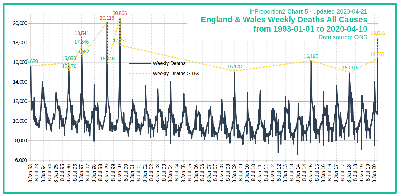
Late reservation: One problem with the graphs in the FT article is that they provide no historical context, that is, they do not show whether similar spikes were to be observed in the past decades. By contrast, chart InProportion2_Chart5.png, inproportion2.talkigy.com, does not suffer from this problem, and has now been corroborated by graphs in #Excess deaths in England and Wales below. --Dan Polansky (discuss • contribs) 12:09, 5 May 2020 (UTC)
Excess deaths in U.S. states
[edit source]Source Excess Deaths Associated with COVID-19, cdc.gov, provides a valuable picture on what is going on with deaths in U.S. states, by providing graphs of weekly all-cause deaths.
Weekly deaths, changes from long-term trend value to 2020 peak value, rounded to give an idea of the scale, for selected jurisdictions:
| Jurisdiction | Base → Peak | Peak Week Excess % |
| U.S.: | 60,000 → 80,000 | 37% |
| New York City: | 1,100 → 7,000 | 526% |
| New York: | 2,000 → 5,300 | 159% |
| New Jersey: | 1,500 → 4,500 | 193% |
| Massachusetts: | 1,200 → 2,300 | 86% |
| Pennsylvania: | 2,700 → 5,200 | 90% |
| Michigan: | 2,000 → 3,200 | 55% |
| Connecticut: | 740 → 1,000 | 35% |
| Texas: | 4,200 → 4,700 | 12.7% |
| California: | 5,500 → 5,600 | 7.4% |
| Florida: | 4,400 → 4,600 | 2.6% |
Note that the righthand value is a peak rather than a value sustained over multiple weeks.
As you can see, the peak ratios and the corresponding excess death percentages vary wildly, New York City leading the pack by a wide margin.
The regions one can choose from seem to be jurisdictions, mostly U.S. states; New York City is not a subset of New York.
deaths per capita, realclearpolitics.com, would suggest where to look for excess deaths; top 5 U.S. states by covid-coded deaths per capita are New York, New Jersey, Michigan, Massachusetts, and Pennsylvania (it changes live). Also of interest is File:COVID-19 outbreak USA per capita cases map.svg.
--Dan Polansky (discuss • contribs) 08:50, 3 May 2020 (UTC)}
The percentages from the above table except for U.S. as a graph:
| Graphs are unavailable due to a known technical issue. Updates on reimplementing the Graph extension can be found on Phabricator and on MediaWiki.org. |
--Dan Polansky (discuss • contribs) 17:13, 5 May 2020 (UTC)
- Graph expanded from CDC data. --Dan Polansky (discuss • contribs) 18:23, 6 May 2020 (UTC)
- x grid dropped. --Dan Polansky (discuss • contribs) 08:21, 8 May 2020 (UTC)
Excess deaths in London
[edit source]As per above post, we know excess deaths in New York City, showing that in a densely populated urban area that is a business hub, the covid can manifest itself quite strongly in excess deaths likely caused by it. Naturally, we would like to have a similar picture for London, another densely populated business hub.
Alas, I cannot find similar information for London. The best I can find is for England, from here; there, the weekly peak of excess deaths seems to be slightly above 100%. This is likely to be diluted by averaging over the whole population of England and the picture for London is likely to show concentration. It is disappointing that the authorities fail to provide relevant and timely data supporting rational decision making.
--Dan Polansky (discuss • contribs) 09:25, 3 May 2020 (UTC)
London is in the FT article: Global coronavirus death toll could be 60% higher than reported, Apr 26, ft.com (Financial Times). From looking at the graph with naked eye without having the numbers, the peek week appears to show excess deaths of about 150% (all-cause to baseline ratio of about 2.5). --Dan Polansky (discuss • contribs) 10:32, 4 May 2020 (UTC)
Source Deaths registered weekly from 1993 to 2018 by region, England and Wales, www.ons.gov.uk, gives us weekly deaths for England and Wales but also specifically for London. Using that data from the downloaded xls, and expanding it with the data from publishedweek522019.xls and publishedweek172020.xlsx from Deaths registered weekly in England and Wales, provisional, ons.gov.uk, we get the following chart of weekly deaths for London:
| Graphs are unavailable due to a known technical issue. Updates on reimplementing the Graph extension can be found on Phabricator and on MediaWiki.org. |
As a limitation, there is something wrong above with the rendering of the x-axis, which should end on 2020/04/24.
What we see above is that while there were not so large spikes in recent years, there was a huge spike in 2000 and some other years. The above is inspired by InProportion2_Chart5.png, inproportion2.talkigy.com, which provides a similar graph not for London but rather for England and Wales.
The above gives an important context for interpreting severity of all-cause death spikes observed in 2020.
--Dan Polansky (discuss • contribs) 13:57, 4 May 2020 (UTC)
- Expanded. --Dan Polansky (discuss • contribs) 13:37, 5 May 2020 (UTC)
- Added grid. --Dan Polansky (discuss • contribs) 15:51, 7 May 2020 (UTC)
- Dropped x grid. --Dan Polansky (discuss • contribs) 12:52, 9 May 2020 (UTC)
Excess deaths in England and Wales
[edit source]On England and Wales level, chart InProportion2_Chart5.png, inproportion2.talkigy.com, is striking: it shows weekly all-cause deaths from 1993 to 2020 and makes it obvious that while the 2020 peak is much higher than some recent year peaks, multiple years were even worse, including 2000 with the peak week having 20,566 deaths while the bottom for 2000 was under 10,000 deaths. The chart identifies ONS as the data source. Would we be able to independently reproduce the chart from ONS data? Caution: The peak known today is probably higher than what the graph shows; the graph was updated on Apr 21. The great thing about the chart is that it shows a period spanning decades whereas Euromomo only shows a few recent years.
Let's get started with quarterly rolling annual death counts. We use the source Changing trends in mortality in England and Wales (Experimental Statistics) - supporting data, ons.gov.uk. We download the xls and look at England ASRs tab, which has data starting at 1990. In the tab, for Q1 1993 - Q4 1993, we get 260 896 deaths for males and 280 006 deaths for females, totalling 540902 deaths; for Q1 2018 - Q4 2018, we get 250 012 for males and 255 847 for females, totalling 505859 deaths. Between 1993 and 2018, the population has increased, suggesting that 1993 was even worse year for mortality than the bare counts would suggest. We do not have the sought weekly data yet, but have at least some data spanning multiple decades to look at. The inProportion chart has a high weekly peak in 2000; the quarterly rolling dataset has, for Q1 2000 - Q4 2000, 239 931 male deaths and 263 094 female deaths, totalling 503 025 deaths. This is interesting: while year 2000 has a much more pronounced weekly spike in InProportion2_Chart5.png, it has lower mortality on a whole-year basis than year 1993.
Another source for yearly deaths is Death registrations, Populations and Age Standardised Rates, England 1981 to 2018, ons.gov.uk. After downloading the xls, on tab Table 6 we find both deaths and deaths per 100 000 pop per year, for 1981-2018, and we see how deaths per 100 000 pop went from 1633 in 1981 to 947 in 2018; absolute counts went from 541 046 deaths to 505 859 deaths. From the source, tab Table 4 of the xls, we obtain the following chart, for England but not for Wales:
| Graphs are unavailable due to a known technical issue. Updates on reimplementing the Graph extension can be found on Phabricator and on MediaWiki.org. |
| Graphs are unavailable due to a known technical issue. Updates on reimplementing the Graph extension can be found on Phabricator and on MediaWiki.org. |
Finally, the sought source is Deaths registered weekly from 1993 to 2018 by region, England and Wales, www.ons.gov.uk, which not only gives us weekly deaths for England and Wales but also specifically for London. Using that data (summing the columns), and expanding it with the data from publishedweek522019.xls and publishedweek172020.xlsx from Deaths registered weekly in England and Wales, provisional, ons.gov.uk, we get the following chart:
| Graphs are unavailable due to a known technical issue. Updates on reimplementing the Graph extension can be found on Phabricator and on MediaWiki.org. |
The above corroborates InProportion2_Chart5.png, inproportion2.talkigy.com, while the above has additional data points at the right; however, there is something wrong with the rendering of the x-axis, which should end on 2020/04/24.
--Dan Polansky (discuss • contribs) 17:32, 4 May 2020 (UTC)
- Expanded. --Dan Polansky (discuss • contribs) 11:31, 5 May 2020 (UTC)
- Added grids. --Dan Polansky (discuss • contribs) 15:56, 7 May 2020 (UTC)
- Dropped x grid. --Dan Polansky (discuss • contribs) 05:51, 8 May 2020 (UTC)
Excess deaths in Sweden
[edit source]A graph for Sweden of all-cause deaths of the Euromomo-kind can be seen in Veckorapport om covid-19, vecka 17, folkhalsomyndigheten.se; in Figur 8. Antal dödsfall i Sverige i alla åldrar samt förväntat antal dödsfall per vecka 2016- 2020, till och med vecka 15. The vertical axis of Figure 8 does not start at zero but rather at 1000 deaths.
For week 15, the baseline deaths are about 1750 deaths and the actual deaths are over 2600 deaths. The peak in 2018 reached about 2200 deaths in the peak week. Therefore, the 2020 peak weekly deaths so far are about 20% higher than the peak weekly deaths in 2018.
On Euromomo[3], Sweden deaths peaked on week 15 (z-score, not death count), and weeks 16 and 17 show an improvement, although they suffer from registration delay as suggested by the yellow vertical bar in the graph.
--Dan Polansky (discuss • contribs) 11:44, 3 May 2020 (UTC)
Update: Week 18's report by FHOM is out. Figur 9 shows all-cause deaths in week 16 lower than week 15, consistent with Euromomo[4].
The reports for week 17 and week 18 confirm the registration delay, in Figur 7A: for week 17, the week-17 report has about 400 deaths deaths while the week-18 has over 500 deaths. Week 16 deaths also show an increase between week-17 report and week-18 report, but much less pronounced. It is probably this registration delay why the week-18 report omits week 17 in its all-cause death Figur 9, a sound practice. An alternative would be to use statistical inference using the mean percentage by which the last-week counts tend to be under the real counts; however, that would introduce more uncertainty and be less raw. --Dan Polansky (discuss • contribs) 11:11, 9 May 2020 (UTC)
An all-cause weekly death figure based on FHOM's report:

--Dan Polansky (discuss • contribs) 16:27, 22 May 2020 (UTC)
New: Using data and the idea for the graph from Number of deaths per day 2015-2020, scb.se, Tabell 1, we can plot all-cause deaths for 2015-2020:
| Graphs are unavailable due to a known technical issue. Updates on reimplementing the Graph extension can be found on Phabricator and on MediaWiki.org. |
And here the total deaths from Jan 1 to May 7 (including) excluding Feb 29, calculated from the same source:
| Graphs are unavailable due to a known technical issue. Updates on reimplementing the Graph extension can be found on Phabricator and on MediaWiki.org. |
--Dan Polansky (discuss • contribs) 07:36, 23 May 2020 (UTC)
Latest weekly FOHM report, week 37 (FOHM: Folkhälsomyndigheten[5]):
--Dan Polansky (discuss • contribs) 10:30, 21 September 2020 (UTC)
Excess deaths in Europe
[edit source]We do not have excess deaths for the whole of European Union (or I don't) but we do have excess deaths for the countries that participate on Euromomo. The relevant Euromomo graph showing weekly all-cause death counts is here; the graph vertical axis does not start at zero but rather at 40 000.
We see the peak for the participating countries at week 14, with 86 737 deaths in that week, against the baseline of 55 008 deaths in that week. A 2017 peak was 70 692 deaths on week 2. Therefore, the 2020 weekly peak so far was 23% higher than the weekly peak in 2017.
As a reservation, the aggregate European picture is not so interesting since it results from averaging of countries of virtually zero impact and countries with significant impact. While excess deaths can be seen in Euromomo per individual country, they are shown not as death count but rather as a z-score, which I find hard to interpret.
Let us ask a different question: on which week did various European countries see a peak, among the Euromomo countries/regions?
- Countries/regions with no upward bump in deaths to talk of: Austria, Denmark, Estonia, Finland, Germany (Berlin), Germany (Hesse), Greece, Hungary, Ireland, Luxembourg, Malta, Norway.
- Coutries/regions with a peak, peak week: Belgium: w15, France: w14, Italy: w14, Netherlands: w14, Portugal: w14 (very small peak), Spain: w14, Sweden: w15, Switzerland: w14, UK (England): w14 (still peaking), UK (Nothern Ireland): w15, UK (Scotland): w15, UK (Wales): w15.
Therefore, all the peaks of all-cause weekly deaths are either in week 14 (ending on Friday Apr 10) or week 15 (ending on Friday Apr 17); the UK (England) peak is still developing. Today (May 3) is near the beginning of week 18.
--Dan Polansky (discuss • contribs) 12:53, 3 May 2020 (UTC)
Efficacy of lockdowns
[edit source]Multiple countries enforced lockdowns described in the media as draconian, the suspicion being some of them unconstitutional. What is their efficacy? How much did the lockdowns contribute to slowing down the covid spread?
These are serious questions and need proper scientific investigation rather than being answered by reference to obviousness and intuition.
In medicine, we have the institution of double blind trial. One feature of such a trial is that there is a group of patients being administered an intervention such as a medical drug and there is a control group administered placebo or other control substance such as previously used drug. Beyond that, there are two blinding measures. For lockdowns, one cannot have the blinding: the subjects of the lockdown know whether they are in a lockdown. But one can at least have a control group, that is, a country that does not have a lockdown or has a milder form of a lockdown. In medicine, the control group should be similar to the intervention group in key characteristics: there should be a similar distribution of age, sex, morbidities and the like. A similar principle would ideally be applied to a control group in lockdown efficacy investigation. Achieving that for lockdown is hard: while Sweden is one example that could be used as a control group, Sweden may have unique demographics that needs to be accounted for. Demographics of different countries such as population density and standard of medical care differ.
Either way, anyone making efficacy claim should show us the table showing how the assumed driving characteristic correlates with the target characteristic. If someone claims a lockdown predicts lower deaths per capita and lack of lockdown predicts higher deaths per capita, they should give us 1) country selection criteria, 2) list of countries meeting the criteria, 3) a column indicating the presence of the lockdown, and 4) a column stating the deaths per capita; they should then show the calculated correlation, if any. That would be a minimum.
Let us recall what happened in medicine when the urge to do something, anything, to intervene prevailed over evidence-based medicine, which is largely a 20th century invention. In medicine, medical doctors ("experts") administered bloodletting and caused damage in many other ways.
--Dan Polansky (discuss • contribs) 13:09, 3 May 2020 (UTC)
One tool to get an idea of efficacy (not a scientific study) is Oxford University Coronavirus Government Response Tracker, bsg.ox.ac.uk. It features a chart plotting maximum stringency level against number of covid-19 cases. The chart shows a correlation trendline that is dashed; the trendline seems to be mildly going upward, and therefore, the stringency of measures seems to be mildly predictive of increase of covid-19 cases. However, let's remember that correlation is not causation. Interpretation caution is required. Do the lockdown efficacy claimers have anything better? --Dan Polansky (discuss • contribs) 08:00, 4 May 2020 (UTC)
There is a non-peer-reviewed preprint of a study: Full lockdown policies in Western Europe countries have no evident impacts on the COVID-19 epidemic. by A. J. Meunier, May 1, medrxiv.org. --Dan Polansky (discuss • contribs) 12:25, 5 May 2020 (UTC)
New research:
- A country level analysis measuring the impact of government actions, country preparedness and socioeconomic factors on COVID-19 mortality and related health outcomes, July 21, 2020, thelancet.com
The above investigation included look at correlations of obesity, median population age, GDP, time to border closures from the first reported case, and more.
Link discovery credit: Daniel Levitt, son of the Nobel laureate Michael Levitt. --Dan Polansky (discuss • contribs) 13:08, 23 July 2020 (UTC)
I created COVID-19/Efficacy of lockdown. --Dan Polansky (discuss • contribs) 13:59, 23 July 2020 (UTC)
Neil Ferguson wrong about Sweden
[edit source]Neil Ferguson is noted for the Imperial College study that made U.K. make a U-turn. Let's consider this:
- Prof. Neil Ferguson defends UK Coronavirus lockdown strategy, Apr 25, Unherd at youtube.com
- "... but I think we're gonna see there deaths slowly ... day by day increase, daily deaths day by day increase ...", around 3:26
The claims made above by Neil Ferguson are obviously incorrect. Swedish daily deaths are not increasing and have not been increasing for some time. It follows from W:2020 coronavirus pandemic in Sweden#Statistics, sourced from FOHM. And the daily new deaths not increasing was apparent back on Apr 25 in the graph of new daily deaths.
A YouTube comment says: "In 2009, one of Ferguson's models predicted 65,000 people could die from the Swine Flu outbreak in the UK — the final figure was below 500. Similarly, he was accused of creating panic by overestimating the potential death toll during the 2005 Bird Flu outbreak. Ferguson estimated 200 million could die. The real number was in the low hundreds."
I need to double check the above. I found Six questions that Neil Ferguson should be asked, Apr 16, 2020, spectator.co.uk. The article links to Bird flu pandemic 'could kill 150m', Sep 30, 2005, theguardian.com, from which I quote:
- 'Last month Neil Ferguson, a professor of mathematical biology at Imperial College London, told Guardian Unlimited that up to 200 million people could be killed.
- "Around 40 million people died in 1918 Spanish flu outbreak," said Prof Ferguson. "There are six times more people on the planet now so you could scale it up to around 200 million people probably."
--Dan Polansky (discuss • contribs) 16:26, 5 May 2020 (UTC)
Correction: Post #Mike Graham wrong about Sweden how has a graph with 7-day moving average of daily deaths by day of report. Contrary to what I said above, it was not obvious on Apr 25 from that graph that daily deaths were not increasing. On the other hand, that graph suffers from double delay and a professional epidemiologist should know that. In retrospect, we now see that the daily deaths are indeed not increasing but rather have gone down a little, but that is a retrospect. Either way, the Neil Ferguson Apr 25 prediction was wrong. --Dan Polansky (discuss • contribs) 08:56, 6 May 2020 (UTC)
And now this:
- Neil Ferguson: UK coronavirus adviser resigns after breaking lockdown rules, May 5, theguardian.com
- "Prof Neil Ferguson, the epidemiologist whose modelling helped shape Britain’s coronavirus lockdown strategy, has quit as a government adviser after flouting the rules by receiving visits from his lover at his home. [...] The visits clearly contravene the government’s “stay at home, save lives” message, which urges people to remain within their family groups and not mix with members of other households."
--Dan Polansky (discuss • contribs) 19:19, 6 May 2020 (UTC)
And what about this:
- Architect of COVID-19 lockdowns resigns after flouting social distancing rules, May 6, justthenews.com
- "Within a week of his report’s release, questions were being asked about Ferguson’s methodology. His response only rang more alarm bells: “I wrote the code (thousands of lines of undocumented C) 13+ years ago to model flu pandemics.” [...] Ferguson then claimed he was unable to publish his model until Microsoft began helping him sort out his code, in the last days before Bill Gates stepped down from the software giant’s board.
That's as far as reproducibility of what Ferguson is doing. From the same article, we learn about predictions for foot and mouth disease:
- "During the 2001 outbreak of foot and mouth disease among cattle and sheep in the U.K., six million animals were slaughtered as a precaution after Ferguson warned the government that 150,000 people could die. As it turned out, only 200 died."
--Dan Polansky (discuss • contribs) 21:11, 6 May 2020 (UTC)
Let us make one thing clear: the Ferguson lover-visit affair is not or should not be about anyone's sex life but rather about the credibility of someone who breaks the rules that they help impose upon millions of people in the U.K. and U.S., rules for which we still do not have a scientific paper supporting their efficacy. True enough, an excellent scientist could help supply factual inputs into excellent policy decision and then act against that decision in a moment of moral failing, but such misconduct would still be one piece in the credibility puzzle. If we are to defer to scientists and experts as we to some extent must, we must develop the skill and knowledge to distinguish true scientists and experts from pseudo-scientists and pseudo-experts. One might still argue that this is ad hominem reasoning and that we should examine the substantive claims of the expert rather than the expert. That would be ideal, but that is something that those who are not experts may find hard to do; examining the credibility of the expert seems hard to do without entirely. When experts disagree about a matter as they often do, it is the choice of experts to defer to rather than the principle of expert knowledge that rules the day. --Dan Polansky (discuss • contribs) 07:53, 7 May 2020 (UTC)
Falsifiability of probabilistic statements
[edit source]Let us consider a statement of the form "With probability of 5%, X is going to happen". How do we expose such a statement to stringent tests threatening to refute/falsify the statement? From what I can see, no observed occurrence in the world could possibly directly refute the statement, and therefore such a statement is not a scientific hypothesis by the Popperian criterion of falsifiability. Such a statement can probably still be criticized using some empirical basis, but I currently do not see how it could be directly refuted. In particular, if X does not happen, that is by far not a refutation of the anterior 5% probability of X, let alone that it could have happened. Actually, could statements seem to have no empirical content at all; they appear to have zero direct refutability.
A hypothesis that does not run the risk of being refuted is thereby not a scientific hypothesis.
How can we scientifically test (attempt to refute) epidemiological hypotheses formulated as probabilitic statements or even as an unquantified "could"? I don't know.
Let us examine some consequences of the above reasoning. The statement (A) "With probability of 1/6, this particular die is going to have 6 as the next outcome" would be a hypothesis that would not be scientific. By contrast, the statement (B) "This particular die is a fair die, having equiprobable outcomes" is a scientific hypothesis, one that runs the risk of being refuted (not conclusively refuted, but probabilistically refuted or shown to be unlikely). However, we see that A is a logical consequence of B, which is empirically testable. Something seems not quite right; a more refined theory of scientific character of theories is required. In any case, if we have an empirically testable theory like B, and we verify the theory by attempted refutation, it seems we can save A via B; if we do not have B or its analogue, the unscientific character of A remains. The relationship between B and A above is one of necessary consequence (B => A), not merely a heuristic inference relying on very uncertain inputs such as parameters.
--Dan Polansky (discuss • contribs) 11:53, 6 May 2020 (UTC)
Comparison to Hong Kong flu (1968 flu)
[edit source]There is a very interesting article Half a century ago stoic Britons battle a similar health crisis without any lockdown, May 2, telegraph.co.uk (article discovery via Peter Hitchens). It describes what happened in 1968 as for a certain flu pandemic. The Wikipedia article is W:Hong Kong flu; it tells us that "The CDC estimated fewer than 100,000 people died in the U.S". As per the Telegraph article, "By the spring of 1970, it [1968 flu] had killed over one million people worldwide, 80,000 of them in the UK." As of today (May 7), the count of covid-coded deaths in the U.K. is 30,076[6]. Corrected for population, we get 1515 deaths per million pop for 1968 flu (ca 52,800,000 pop in 1968[7]) and 476 per million pop for covid-19 (ca 63,182,000 pop). If the covid-coded deaths eventually reach the triple of today, that would be 1428 deaths per million pop.
Further from Wikipedia about the 1968 Hong Kong flu, "In Berlin, the excessive number of deaths led to corpses being stored in subway tunnels, and in West Germany, garbage collectors had to bury the dead due to insufficient undertakers."
The figures calculated above, as a table:
1968 flu deaths, U.K.:             1515  per million pop
covid-19 deaths May 7, U.K.:        476  per million pop
covid-19 deaths May 7 * 3, U.K.:   1428  per million pop
It is a pity that the weekly all-cause death graph in #Excess deaths in England and Wales only goes back to 1993; it would be good to see going it back to 1960.
--Dan Polansky (discuss • contribs) 08:59, 7 May 2020 (UTC)
Links:
- 1968 flu pandemic, britannica.com
- Half a century ago stoic Britons battle a similar health crisis without any lockdown, May 2, telegraph.co.uk
- Hong Kong flu, wikipedia.org
--Dan Polansky (discuss • contribs) 14:51, 22 May 2020 (UTC)
Cumulative all-cause death totals for England and Wales
[edit source]In #Excess deaths in England and Wales, we have looked at peak weekly all-cause deaths. That particular view on data is useful, and is relevant e.g. for impact on healthcare since high peak of deaths seems likely to have associated antecedent increased demand on ICU beds. However, a peak occuring on a single week does not give us the complete picture of death impact.
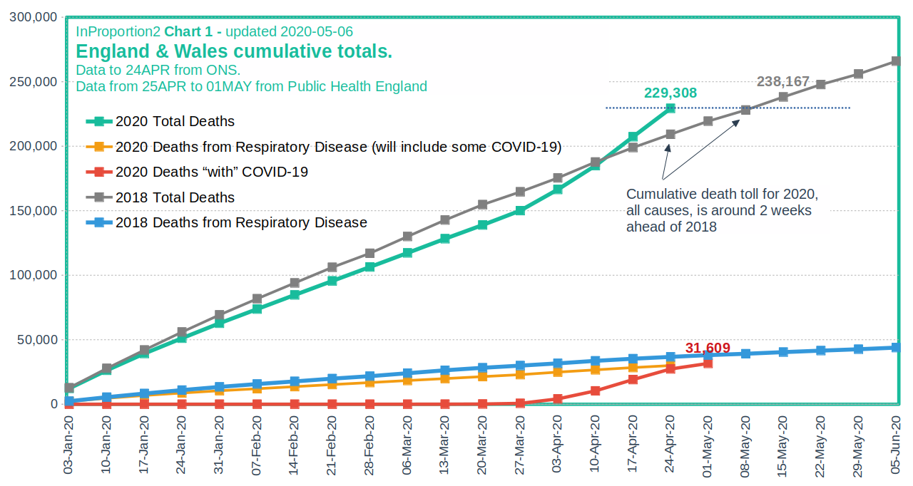
Cumulative all-cause death totals can be compared between various years. A cumulative total for, say, Apr 1, is the total of all deaths that occurred from Jan 1 to Apr 1. That is what InProportion2_Chart1_200506.png, inproportion2.talkigy.com, does, showing that 2020 is not very bad compared to 2018 for England and Wales; the chart update is from May 6. The image indicates ONS and Public Health England as the data source. I do not have the energy to corroborate (verify) the chart, but let me note that another chart from inproportion2.talkigy.com, InProportion2_Chart5.png, passed verification at #Excess deaths in England and Wales.
--Dan Polansky (discuss • contribs) 10:45, 7 May 2020 (UTC)
Daily cases as percentage of tests for Czechia and Italy
[edit source]Daily cases as percentage of tests for Czechia[8] and Italy[9][ratio self-calculated]:
| Graphs are unavailable due to a known technical issue. Updates on reimplementing the Graph extension can be found on Phabricator and on MediaWiki.org. |
| Graphs are unavailable due to a known technical issue. Updates on reimplementing the Graph extension can be found on Phabricator and on MediaWiki.org. |
--Dan Polansky (discuss • contribs) 15:26, 7 May 2020 (UTC)
- Czech updated. --Dan Polansky (discuss • contribs) 10:32, 23 May 2020 (UTC)
Also for Iceland[10]:
| Graphs are unavailable due to a known technical issue. Updates on reimplementing the Graph extension can be found on Phabricator and on MediaWiki.org. |
--Dan Polansky (discuss • contribs) 11:14, 8 May 2020 (UTC)
Weekly cases as percentage of tests for Sweden[11]:
| Graphs are unavailable due to a known technical issue. Updates on reimplementing the Graph extension can be found on Phabricator and on MediaWiki.org. |
--Dan Polansky (discuss • contribs) 17:16, 9 May 2020 (UTC)
- Sweden updated. --Dan Polansky (discuss • contribs) 13:38, 31 May 2020 (UTC)
Charts of test positivity rate for various countries:
- The share of daily COVID-19 tests that are positive - Our World in Data, ourworldindata.org
--Dan Polansky (discuss • contribs) 18:06, 8 July 2020 (UTC)
Test positivity rate for US, calculated from Our World in Data, from owid-covid-data.csv[12], smoothed via 7-day moving average:
| Graphs are unavailable due to a known technical issue. Updates on reimplementing the Graph extension can be found on Phabricator and on MediaWiki.org. |
The above can be done for any of the many countries available in owid-covid-data.csv. --Dan Polansky (discuss • contribs) 18:29, 16 July 2020 (UTC)
Immunization percentage in Czechia
[edit source]As per this[13], the immunization in Czechia is in multiples of per mille, that is, strictly less than 1%. That is to say, by extrapolating from a properly randomized study, strictly less (maybe much less) than 1 in 100 inhabitans would test positive on covid antibodies. The results are yet to be made official. That is to say, from Mar 15 (day of nationwide quarantine) to today, May 7, (more than 8 weeks), Czechia made very little progress toward herd immunity. That would be consistent with the rather low death rate per million pop. However, there are areas of higher concentration: Prague up to 1.48%, Brno up to 1.87% and Olomouc up to 4%. --Dan Polansky (discuss • contribs) 16:52, 7 May 2020 (UTC)
Efficacy of cloth face masks
[edit source]Let's have a look at efficacy of wearing cloth face masks (non-medical masks) in reduction of covid-19 spread, on the principle that the wearer does not protect themselves (cloth mask cannot do that) but rather others. Only medical-grade masks can protect the wearers.
While face masks are seen by some as intrusion into liberty, they are a relatively minor intrusion (especially compared to lockdowns) and their mandatory wearing in certain places such as hospitals and public transport seems to have rather mild adverse economic impact, if any at all. Furthermore, mandating wearing face masks can be done in a differentiated manner depending on daily rate of infection in a region, if desired.
Anectodally, it seems face masks should make a positive difference. On a bus in Czechia, I saw and heard someone caugh into the mask, and that person did not have the nose covered, only the mouth, in violation of the Czech law, suggesting a certain carelessness. That was back in June when face coverage was mandatory in public transport. Intuitivelly, that person could not spread the droplets from caughing as far with the mask as without mask.
Of course, anecdotes and intuitions are no more than that and do not constitute science and reliable knowledge. Ideally, we need properly conducted and controlled studies.
One objection is that the increased feeling of safety can lead to increased risk behavior such as reduction of the social distance kept. However, such behavior would be irrational in so far as wearing cloth mask protects others, not the wearer, a difference when compared to e.g. wearing helmets by bicycle drivers. In any case, before this is properly demonstrated, the objection remains speculative.
Mandating the wearing top-down seems to be key. If, say, 50% of people on the bus wear the face mask and 50% don't, the spread reduction is only moderate and a vulnerable person cannot really feel safe.
Relevant reading:
- 5 Questions: Stanford scientists on COVID-19 mask guidelines, June 19, med.stanford.edu
- "On June 18, California Gov. Gavin Newsom issued a statewide order requiring people to wear masks in most public spaces."
- "If two people are wearing masks, the viral particles can travel about 5 feet away from each individual. When an infected person is not wearing a mask, those particles can floatthrough the air 30 feet or more and stay alive for up to 30 hours."
- Face Masks Against COVID-19: An Evidence Review, 13 May 2020, preprints.org
- Controversy on COVID-19 mask study spotlights messiness of science during a pandemic, June 24, cidrap.umn.edu
- "Late last week, a group of researchers posted a letter that they had sent to the Proceedings of National Academy of Sciences (PNAS) requesting the retraction of a study published the week before that purportedly showed mask use was the most effective intervention in slowing the spread of COVID-19 in New York City."
- Can masks help with reopening the economy?, Apr 2020, siepr.stanford.edu
- Factbox: What the WHO recommends on face masks, June 5, reuters.com
- "The World Health Organization (WHO) updated its guidance on Friday to recommend that governments ask people wear fabric face masks in public places to curb the spread of the pandemic COVID-19 disease caused by the new coronavirus."
- Advice on the use of masks in the context of COVID-19, 5 June, who.int
- Face Masks for the General Public, May 4, rs-delve.github.io - Royal Society DELVE Initiative
- Do face masks work? A note on the evidence by Dr John Lee, Apr 19, spectator.co.uk - an article skeptical about the Face Masks Against COVID-19: An Evidence Review preprint
- Masks Don’t Work: A Review of Science Relevant to COVID-19 Social Policy by Denis G. Rancourt, PhD, June 11, rcreader.com
- "In a landmark study, Shaman et al. (2010) showed that the seasonal pattern of extra respiratory-disease mortality can be explained quantitatively on the sole basis of absolute humidity, and its direct controlling impact on transmission of airborne pathogens."
- "In fact, Shaman et al. showed that R0 must be understood to seasonally vary between humid-summer values of just larger than “1” and dry-winter values typically as large as “4” (for example, see their Table 2)."
- Commentary: Masks-for-all for COVID-19 not based on sound data by Lisa M Brosseau, ScD, and Margaret Sietsema, PhD, Apr 1 2020, cidrap.umn.edu
- Face masks during the COVID-19 pandemic, wikipedia.org
- Nonpharmaceutical Measures for Pandemic Influenza in Nonhealthcare Settings—Personal Protective and Environmental Measures by Xiao et al., May 2020, cdc.gov
- "Although mechanistic studies support the potential effect of hand hygiene or face masks, evidence from 14 randomized controlled trials of these measures did not support a substantial effect on transmission of laboratory-confirmed influenza."
--Dan Polansky (discuss • contribs) 10:03, 5 July 2020 (UTC)
- Expanded. --Dan Polansky (discuss • contribs) 13:27, 7 July 2020 (UTC)
- Expanded. --Dan Polansky (discuss • contribs) 08:10, 18 July 2020 (UTC)
- Expanded. --Dan Polansky (discuss • contribs) 08:39, 10 September 2020 (UTC)
No test counts from China
[edit source]We still do not have test counts from China, as is suggested by the folowing:
- The share of daily COVID-19 tests that are positive - Our World in Data, ourworldindata.org
There is also this:
https://ourworldindata.org/grapher/daily-covid-19-tests-smoothed-7-day
We have test counts from nearly all European countries, from Russia, U.S., Canada, Mexico, Australia, and many more. We have that data from Senegal. But not from China.
Having test counts from China would have been extremely valuable in interpreting the growth rates of positive cases from China and could have prevented some grave errors. Does China not know how many tests they performed? Do they know but do not tell? What's going on here?
Here's Situation report - 177 from WHO, 15 July 2020. In that report I do not see number of tests per country. I also do not see a big red or orange disclaimer indicating that number of tests would be critically needed but some countries do not report them. What is one to think of WHO?
--Dan Polansky (discuss • contribs) 09:35, 16 July 2020 (UTC)