Analyzing art/Composition
Composition
[edit | edit source]| “ | What do the delightful petal arrangement in a red rose, Salvador Dali's famous painting "Sacrament of The Last Supper", the magnificent spiral shell of mollusks and the breeding of rabbits all have in common? Hard to believe, but these very disparate examples do have in common a certain number of geometrical proportion known since antiquity; a number that in the nineteenth century was given the honorifics "Golden Number", "Golden Ratio" and "Golden Section".[1] | ” |
| — Mario Livio, The Golden Ratio: The Story of PHI, the World's Most Astonishing Number. | ||
There is something inspiring in the recognition that the arrangement of objects in a painting is not accidental, and that certain arrangements can be found not only in art, but also in nature itself. This kind of repetition brings alphabet to mind - think about composition as you think about letters. They create the sentence and express ideas, they are (more or less) universal and hence understandable for the recipients.
Types of composition
[edit | edit source]In this section we will focus on the importance of composition. As Wikipedia explains, composition is the placement or arrangement of visual elements or ingredients in a work of art, as distinct from the subject of a work. It can also be thought of as the organization of the elements of art according to the principles of art. There are many types of composition. Realizing which of them were applied to the work of art you are looking at might help understand the piece's meaning.
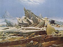
| Diagonal composition consists of one or more diagonal lines which lead the viewer's eye through the painting. Such lines add dynamism and energy, having strong impact on our reception. It may awake certain emotions: the feeling of unrest, anxiety, impatience. Caspar David Friedrich's The Sea of Ice is an example of this type. [2] |  |
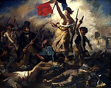
| Radiating lines begin at various points in the painting and are all directed towards the main focus: the element which is the most important in the piece. To see an example take a look at Liberty Leading the People by Eugène Delacroix. |  |
| The S shape composition can be observed when the elements of the painting are arranged in a way that creates an "S-like" shape. This kind of composition helps guide the viewer's eye through the painting. Caravaggio's Crucifixion of Peter serves as an example. |  |
| The L shape composition appears when the elements create the "L" shape which can be (and often is) multiplied. The static horizontal and vertical lines this kind of composition presents create the feeling of rest, stillness and harmony. Look at Caspar David Friedrich's View of a Harbour. |  |
| Grouping draws the viewer's attention to certain elements of the painting. There might be just one or more groups - depending on their arrangement, the balance of the work changes. See Chełmoński's Partridges in the snow. |  |
Perspective
[edit | edit source]Now that we know the basic types of composition, we might move to the next point. There are many more tools which help organize a painting.
The Golden Ratio, which creates perfect harmony, was known as "The Divine Proportion" and the secret of beauty since the Renaissance. Leonardo da Vinci used this tool in many of his works.
Worm's-eye view presents the scene as seen from a very low point of view. Automatically, the image makes an impression of huge, majestic, scary, divine, powerful or horrid - which means that the perspective augments the feeling that would normally be awaken by the painting. To give you an example: imagine that while strolling in the woods you encounter an enraged wolf. The scenario is scary enough itself, but seeing the very same wolf from down below would be much more terrifying, as the animal would be in the center of your vision, becoming the main focus and blocking your view.
Bird's-eye view can function in the opposite way. Seeing things or scenes from above adds the reflexive, tranquil tone to the painting. It allows the viewer to grasp every detail without the impression of interaction; like an omniscient narrating voice in a novel, the viewer sees and knows everything.
Low horizon gives an impression of a spacious, vast place. It is often used in landscapes - it helps present the view as peaceful and free. Friedrich's View of a Harbour above illustrates this state of tranquility: we can sweep through the entire scene, and it is highly unlikely that something will jump out and surprise us.
High horizon automatically closes the view, directs attention to the ground and to the moment captured in the painting. Look again at Chełmoński's Partridges: the eye is immediately drawn to the foreground and the space around the birds. The painting was not designed to admire distant views.
Exercise
[edit | edit source]Check your ability to recognize various types of composition taking this online | Quiz.
Further reading
[edit | edit source]Bouleau, Charles (2014), The Painter's Secret Geometry: A Study of Composition in Art, New York: Dover Publications.
References
[edit | edit source]- ↑ Livio, Mario (2002) The Golden Ratio: The Story of PHI, the World's Most Astonishing Number, New York: Broadway Books
- ↑ http://www.explore-drawing-and-painting.com/art-composition.html
