Photographic Composition

| Completion status: this resource is considered to be complete. |
| Quality resource: this resource has been proposed for featuring on the main page of Wikiversity. |
There are a handful of simple techniques which will improve the quality of your photographic compositions. With practice, they become second nature.
Lesson 1: Framing
[edit | edit source]- Framing, in photography, means placing an additional object, or objects, in the foreground of the picture for aesthetic purposes. The object does not have to completely surround the main subject.
- A foreground object provides a point of reference.
- It gives a sense of distance and comparative size.
- It can hide elements which detract from the main subject.
- It is aesthetically pleasing, and gives a feeling of completeness to the picture.
- “A tree, a doorway, a window, or even a gap in a fence positioned around the subject can create a frame within the picture’s frame.” (Joy of Photography)
[1] Framing devices: wildflowers, river, tree. [2] Framing device: gateway. [3] Framing device: patio.
Lesson 2: Repetition & Reflection
[edit | edit source]- Make use of the repetition of shapes, colors, lines, objects, etc. They are all around us, and just waiting to be utilized by the photographer who combines observation with creativity.
- Repetition gives form and unity to a composition.
- It can emphasize a theme or a subject.
- Reflections, such as in water or glass, are an effective form of repetition.
- The repetition is not created by the photographer, but merely observed and captured in an effective way in the photograph.
[1] Reflection is a special kind of repetition which is extremely effective. [2] Repetition of shapes on old buildings in the U.K. [3] Repetition of shapes in an auditorium.
Lesson 3: Closing In
[edit | edit source]- Close in on your subject to exclude unwanted elements.
- This is especially important with portraits, both candid and formal, where the subject usually fills the frame and very little else is visible.
- It can be accomplished by getting physically closer, using a telephoto lens, or adjusting your zoom lens.
- It eliminates wasted space within the picture and focuses more attention on the subject.
- It minimizes background distractions.
- Even scenics, with their wider panoramic view, should be carefully composed so that only the desired elements are included in the frame. Wide expanses of plain blue sky, for example, should not take up half the picture frame, but can be reduced to a narrow strip across the top of the picture.
- Closing in can be done after the fact by editing the picture on a computer ("cropping"). However, this is less desireable, as the picture will have to be enlarged after cropping to bring it back to its original size, and picture quality decreases in proportion to enlargement.
- “Some subjects don’t like you close up, so you’ll have to catch them unawares.” (Tim Fitzharris)
Above and below: [1] and [3] The pictures include wasted space and unsightly elements. [2] and [4] The photographer closes in, minimizing distractions and emphasizing the subject.
Lesson 4: Leading Lines
[edit | edit source]- The photographer should be on the alert for leading lines. They most commonly take the form of converging lines.
- Leading lines draw the eye into the picture.
- They can be used to direct the eye to the main subject.
- They give form, unity, and depth to a composition.
[1] The converging lines of buildings, beach, and hills draw the viewer into the picture. [2] The converging lines of the boardwalk focus the viewer’s eye on the subject.
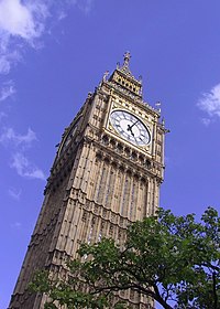
The straight-on shot [3] seems static compared to the angled shot [4], where the parallel lines become converging lines and draw the eye into the picture. In [4], the photographer has also made the image more aesthetically pleasing by including a framing device (the tree) and moving the clock away from dead center (see Rule of Thirds, below).
Lesson 5: Rule of Thirds
[edit | edit source]- As a general rule, it’s a good idea to locate your main subject about a third of the way in from one side or the other, or from the top or bottom, or both.
- This placement is more aesthetically pleasing than simply placing the main subject in the center, which seems predictable and uninteresting.
- Sometimes, a subject may be in the center, but the main center of attention on the subject is a third of the way in, such as the face in a portrait, or the clock on the tower of Big Ben (above right).
- The rule of thirds is a general guideline. There are exceptions to the rule, however. Different types of subject matter or the purposes of the photographer may require a different positioning of the main subject.
[1] The ship is one-third from the right, rather than dead center. Note how the lines in the foreground all lead to the ship. [2] If one were to draw horizontal and vertical lines at thirds, the coastline would roughly follow the lines on the top, bottom, and left of the picture. [3] The sun and its reflection on the water are roughly a third of the way in from the left. The shoreline is about a third of the way up from the bottom. The headland and horizon are more than a third from the top due to the sun, but dead center is still avoided.
Lesson 6: Blur the Background
[edit | edit source]- Emphasize your subject and minimize distracting elements by blurring the background and/or foreground. This is accomplished by using a large aperture setting. (This requires a camera which allows you to control the aperture size and/or shutter speed.)
- The distance within the clear focus area is called the depth of field.
- The depth of field at different settings is marked on better quality lenses.
- To diminish the depth of field, the aperture size must be increased. However, the larger aperture size lets in more light, so to avoid overexposure, the shutter speed must also be increased. The faster shutter speed will let in less light and balance the effect of the increased aperture size on the amount of light which enters the camera.
- The balance between shutter speed and aperture size can be used to either increase or decrease the depth of field.
- Many cameras today have an aperture priority feature. When aperture priority is selected, you can manually set the aperture size and the camera automatically sets the correct shutter speed to go with it. If you have a shutter priority camera, you can increase the shutter speed manually, and the camera will increase the aperture size automatically. Check the readout to see what the aperture size will be, then check the lens markings to see what the corresponding depth of field will be. Some SLRs have a button you can push which lets you see in the viewfinder how a picture would look at a particular aperture setting.
- This method can also be used in reverse for the purpose of having an extremely wide depth of field, which has everything from very near to very far in sharp focus. To accomplish this, use a smaller aperture. This will require a longer shutter speed to compensate for the light loss. If the shutter speed is too long, a tripod may be required. (If you don't have a remote control, use a shutter release cable with the tripod.) A substitute for a tripod, though not as good, is to find a firm place upon which to steady your camera.
- Small aperture: large depth of field. Large aperture: small depth of field.
[1] and [2] The narrow depth of field in these pictures allows only the main subject to be in focus. This eliminates background distractions. It also results in a soft texture which both highlights the main subject and creates a pleasing contrast with the subject's sharp outlines.
Other Tips
[edit | edit source]- Light Source: Always be aware of your light source and how it is acting on your main subject, as well as how it is acting on the scene as a whole.
- Exposure: Expose your main subject correctly, even at the expense of other elements in the picture. This will require a knowledge of how exposure works in your particular camera.
- Fill Flash. If your main subject is in shadow, but set against a bright background (this is often the case with informal portraits), you can set the exposure for the subject, but this usually results in an unpleasant overexposure of the background. If you expose for the background, the subject will be underexposed. The solution is to override the automatic flash and set it to the "on" position. The flash will light up the shadow areas so that both subject and background are correctly exposed.
- Haze: Haze will destroy your scenics, except at sunrise and sunset. When the sun is low, the light acts on the haze in a different, often dramatic, way. But when the sun is high, shoot scenics when there is little or no haze.
- Protect Your Eyes: If your camera is an SLR, and you are using the viewfinder rather than the screen, keep in mind that it is dangerous to look at the sun through a zoom or telephoto lens. These lenses act like magnifying glasses and intensify the sun’s rays.
- Computer Editing: The principles of photographic composition can also be applied to the computer editing of photographs, but there is no substitute for taking a good picture in the first place. The less editing required afterwards, the better.
- Quote: “Once you have mastered a few basics, taking pictures becomes easy.” (Ernst Haas)
Test Yourself
[edit | edit source]Without looking at the descriptions below, see what compositional elements you can identify in the following photographs, then scroll down to see the analyses.
Analysis of the Above Pictures
[1] This example of leading lines is unmistakeable. The lines of the road, both the edges and the painted lines, draw the eye into the picture toward the mountains in the distance.
[2] The shadow replicates the shape of the sculpture, forming a repetition which is aesthetically pleasing and emphasizes the main subject. Note how the placement follows the rule of thirds, with the sculpture being a third of the way in from the right and the shadow a third of the way in from the left. Finally, the subject and its shadow fill the frame, so that the picture does not contain more wasted space or distracting elements than necessary.
[3] A different type of repetition, this time created by the flawless reflection of the building in the water, which creates an inverted image of the subject. Rather than being taken straight on, the buildings are shown from an angle, creating converging lines which add interest to the composition.
[4] This photo shows that leading lines can be more subtle than those of the highway picture (top left). Note the faint lines in the snow, the row of trees, and the fence, all converging towards some unknown place in the woods farther on, and drawing our focus along with them. The picture's center of focus is about a third of the way up, obeying the rule of thirds. There is repetition in the fence posts, and also in the trees on the right with their snow-covered branches.
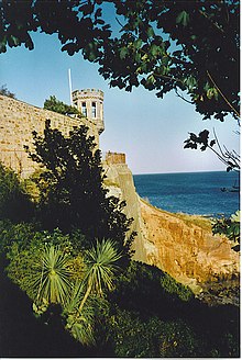
[5] There is a little of everything in this picture. The lookout obeys the rule of thirds, being about a third of the way down and about a third of the way in; the greenery at the top and bottom forms a framing device; and due to the angle, the lines of the wall lead the eye to the focal point of the photograph: the lookout. The photographer has covered an otherwise empty patch of sky with attractive leaves and branches, giving us the feeling that we are in the scene, standing under the tree looking out. Finally, there is a repetitive pattern in the two palms at the bottom of the picture, which adds interest to what is already a captivating composition. The only flaw is that the camera is slightly tilted. This is a common problem, but can be corrected by taking greater care when clicking the shutter button, or after the fact with a good photo software program.
[6] There is a great deal of repetition going on in this picture: the curves of the handles, the tightly wrapped cloth, the points of the umbrella frames, the ripples on the wood, and the parallel lines of the edges of the wooden slats and cross pieces. Yet within all of this repetition there is also variety in the different patterns of wood grain, and the different colors and patterns in the cloth. It may be that the photographer arranged the contents of this picture, rather than just stumbled across it. Or it may be that the umbrellas were already there, but he saw the potential for a picture and just rearranged them a little to suit his purpose. He then closed in tightly so that anything which would take away from the unity of the composition was shut out. All of these things combine to result in a very effective photograph.
[7] The rule of thirds is observed in the placement of the face, which is the visual center of interest, a third of the way down from the top. The picture appears to be set in a busy marketplace, but the photographer has minimized clutter and distracting elements by closing in tightly and filling the frame with his subject.
External links
[edit | edit source]- Michael Elliott looks at various photographic composition and style rules and provides a counterpoint.


