File:IncomeInequality9b.svg
Jump to navigation
Jump to search

Size of this PNG preview of this SVG file: 600 × 600 pixels. Other resolutions: 240 × 240 pixels | 480 × 480 pixels | 768 × 768 pixels | 1,024 × 1,024 pixels | 2,048 × 2,048 pixels | 630 × 630 pixels.
Original file (SVG file, nominally 630 × 630 pixels, file size: 126 KB)
| This is a file from the Wikimedia Commons. The description on its description page there is shown below.
Commons is a freely licensed media file repository. You can help. |
Summary
| Description |
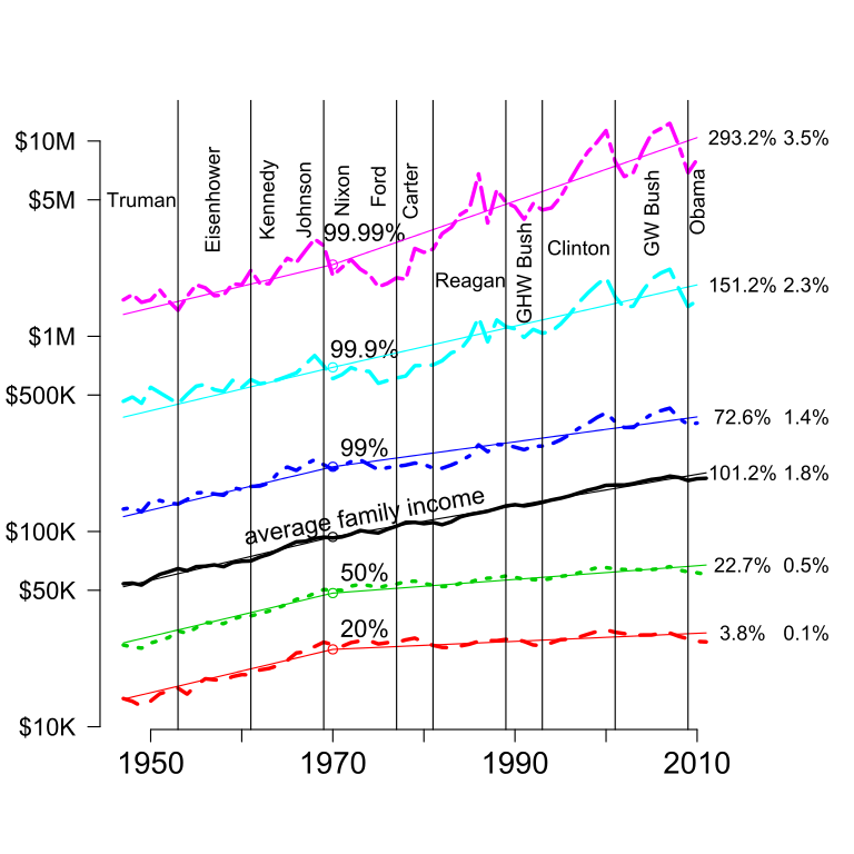
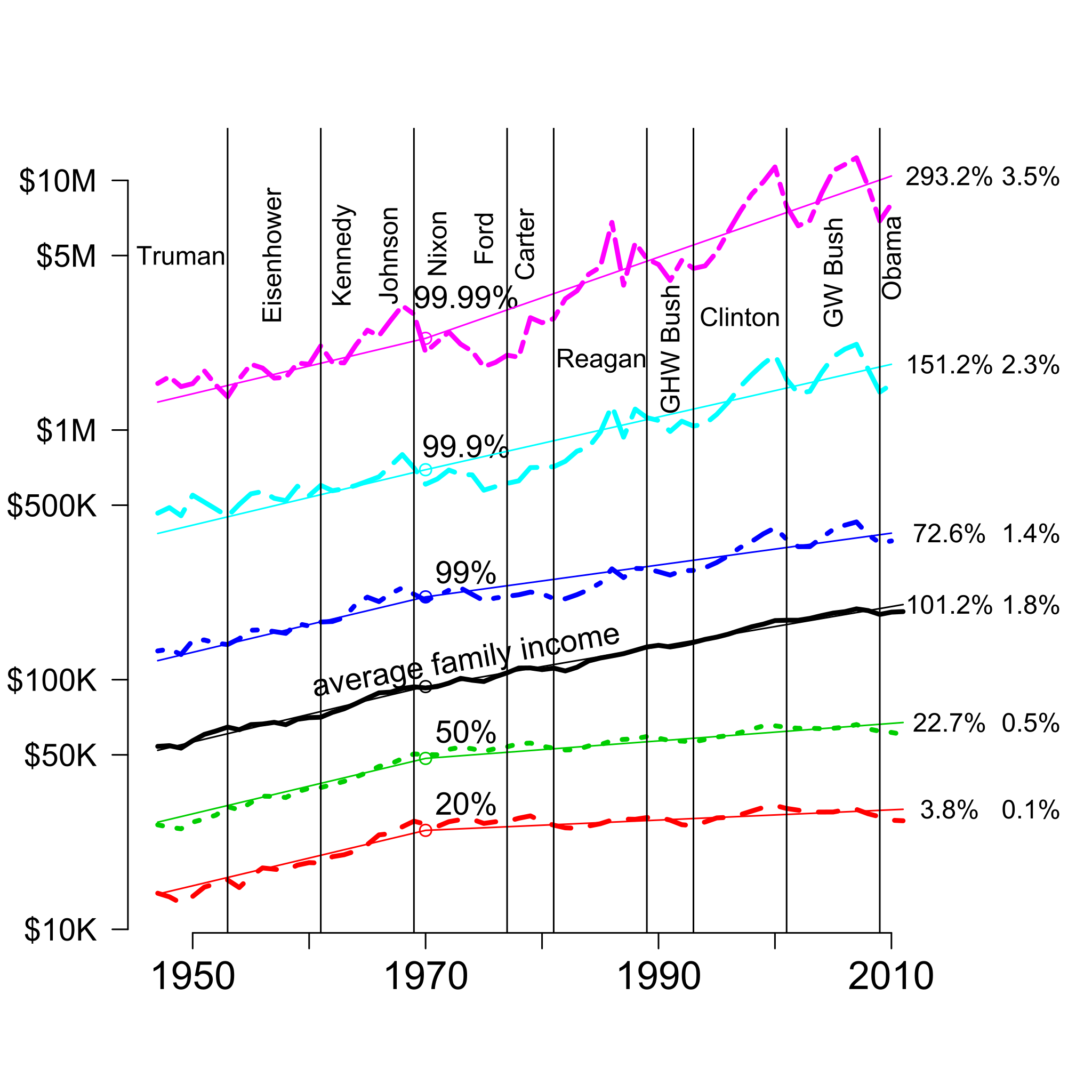
English: This graph shows the income of the given percentiles plus the average from 1947 to 2010 in 2010 dollars. The 2 columns of numbers in the right margin are the cumulative growth 1970-2010 and the annual growth rate over that period. The vertical scale is logarithmic, which makes constant percentage growth appear as a straight line. From 1947 to 1970, all percentiles grew at essentially the same rate; the light, straight lines for the different percentiles for those years all have the same slope. Since then, there has been substantial divergence, with different percentiles of the income distribution growing at different rates. For the median American family, this gap is $39,000 per year (just over $100 per day): If the economic growth during this period had been broadly shared as it was from 1947 to 1970, the median household income would have been $39,000 per year higher than it was in 2010. The median was computed as the geometric mean of the 40th and 60th percentiles. Those two quantiles and the 20th percentile came from US Census Bureau Table F-1.[1] The 99th, 99.9th, and 99.99th percentiles were computed from US Internal Revenue Service data by Piketty and Saez.[2] There are systematic differences between these two sources, but the differences are small relative to the scale of this plot.[3] |
| Date | |
| Source | Own work |
| Author | DavidMCEddy |
Licensing
I, the copyright holder of this work, hereby publish it under the following license:
This file is licensed under the Creative Commons Attribution-Share Alike 3.0 Unported license.
- You are free:
- to share – to copy, distribute and transmit the work
- to remix – to adapt the work
- Under the following conditions:
- attribution – You must give appropriate credit, provide a link to the license, and indicate if changes were made. You may do so in any reasonable manner, but not in any way that suggests the licensor endorses you or your use.
- share alike – If you remix, transform, or build upon the material, you must distribute your contributions under the same or compatible license as the original.
- ↑ Table F-1. Income Limits for Each Fifth and Top 5 Percent of Families[1], (Please provide a date or year), Wikidata Q98791666.
- ↑ Piketty, Thomas; Atkinson, A. B., ed.. Income Inequality in the United States, 1913-2002. Retrieved on 2012-02-08.
- ↑ The differences between the Census and Internal Revenue Service Data can be seen most easily in the 95th percentile, present in both data sets. For more details see “incomeInequality”, in Ecdat: Data Sets for Econometrics[2] (in en), (Please provide a date or year), Wikidata Q105622666.
File history
Click on a date/time to view the file as it appeared at that time.
| Date/Time | Thumbnail | Dimensions | User | Comment | |
|---|---|---|---|---|---|
| current | 06:46, 3 February 2013 | | 630 × 630 (126 KB) | DavidMCEddy | User created page with UploadWizard |
File usage
The following 9 pages use this file:
- Confirmation bias and conflict
- Cost of crony capitalism in the United States
- Documenting crony capitalism
- Electoral integrity in the United States
- Information is a public good: Designing experiments to improve government
- Media and Democracy in Kansas City and Elsewhere
- Media and taxes
- Net neutrality and 'Restoring Internet freedom'
- Social construction of crime and what we can do about it
Global file usage
The following other wikis use this file:
- Usage on en.wikipedia.org
- Usage on pl.wikipedia.org